Welcome to DU!
The truly grassroots left-of-center political community where regular people, not algorithms, drive the discussions and set the standards.
Join the community:
Create a free account
Support DU (and get rid of ads!):
Become a Star Member
Latest Breaking News
General Discussion
The DU Lounge
All Forums
Issue Forums
Culture Forums
Alliance Forums
Region Forums
Support Forums
Help & Search
General Discussion
Related: Editorials & Other Articles, Issue Forums, Alliance Forums, Region ForumsBackward.

or blue ..

Just put together from WilliamPitt's thread here ...
http://www.democraticunderground.com/10021550451#post14
credit to LibDemAlways for the initial thought on 'Backward'

InfoView thread info, including edit history
TrashPut this thread in your Trash Can (My DU » Trash Can)
BookmarkAdd this thread to your Bookmarks (My DU » Bookmarks)
18 replies, 1729 views
ShareGet links to this post and/or share on social media
AlertAlert this post for a rule violation
PowersThere are no powers you can use on this post
EditCannot edit other people's posts
ReplyReply to this post
EditCannot edit other people's posts
Rec (6)
ReplyReply to this post
18 replies
 = new reply since forum marked as read
Highlight:
NoneDon't highlight anything
5 newestHighlight 5 most recent replies
= new reply since forum marked as read
Highlight:
NoneDon't highlight anything
5 newestHighlight 5 most recent replies
= new reply since forum marked as read
Highlight:
NoneDon't highlight anything
5 newestHighlight 5 most recent replies
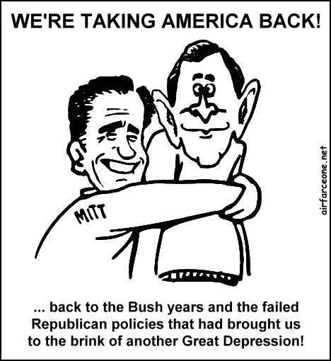
Backward. (Original Post)
doublethink
Oct 2012
OP

Ruby the Liberal
(26,219 posts)1. I would LOVE that logo on this one.


doublethink
(6,823 posts)3. OMG !!
Picture scared me !! 

jsr
(7,712 posts)11. Lovely pair

porphyrian
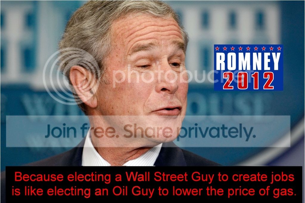
(18,530 posts)2. The red one stands out better.
If you can blur the "RR" logo as much as the other letters, it will look more real.
doublethink
(6,823 posts)5. Had to restart my laptop ...
get the mail etc... anyway, yeah red one stands out better, looked at it on another computer screen. Used a drop shadow in the original script. Soooooo burned a little around the Logo ... a little better ... depending on resolution of your computer screen ...


porphyrian
(18,530 posts)9. That's it.
Should the "D" pull left a smidgeon more, or is the squiggly logo throwing my eyes off?
Sorry, I'm nitpicking and it's not my place. I have issues. 
doublethink
(6,823 posts)12. ....

Our Final Product. Pass it around !!
 Dang I'm the same way, thank's for noticing the 'D' over a snudge. Forgot to save the PSD file ... so just did another quick one.
Enjoy the debate tonight !! And thank's for the input on this ...


porphyrian
(18,530 posts)17. Yes! n/t
Ruby the Liberal
(26,219 posts)18. Ha! Looks great.

napkinz
(17,199 posts)4. it's back to Bush

napkinz
(17,199 posts)7. yep, they're taking the country back!
doublethink
(6,823 posts)14. Excellent n.t.

BumRushDaShow
(129,386 posts)8. K&R
I like the blue one... 
napkinz
(17,199 posts)10. the logic
doublethink
(6,823 posts)13. Keep um coming ... these are great !!


SalviaBlue
(2,918 posts)15. K&R

LibDemAlways
(15,139 posts)16. Awesome. Love it!