General Discussion
Related: Editorials & Other Articles, Issue Forums, Alliance Forums, Region ForumsCampbell's soup cans get new design for first time in 50 years
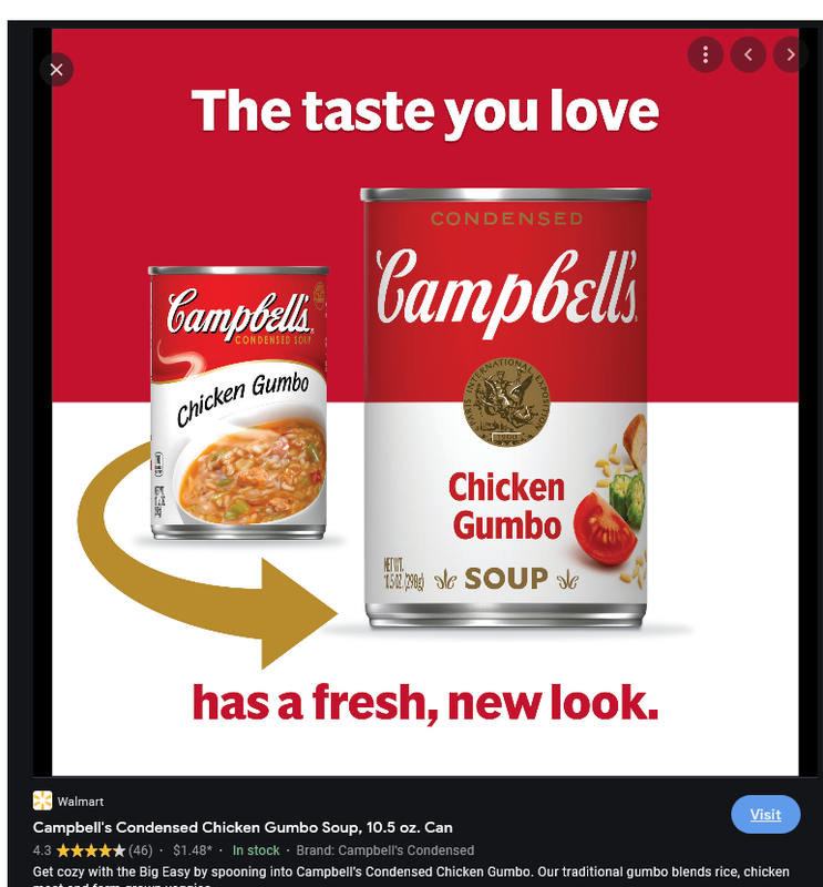
The iconic labels on the flagship product of Campbell Soup Co. are getting their first redesign in five decades.
The famed red-and-white iconography will remain, but the Campbell’s logo is receiving a “modernized logo scripture.” As part of this change, Campbell’s is eliminating the shadow and slightly changing its font, which is based on founder Joseph A. Campbell’s signature.
Other changes to the design include the word “soup” printed in a new font. Campbell’s fans can also pick out subtler elements, such as a more pronounced C in the fleurs-de-lis and a slanted O in the word “soup” — which pay tribute to the letters from the first label, made in 1898. Tomato, cream of chicken, cream of mushroom and chicken noodle will receive the redesigned labels, which are currently rolling out to stores.
Street-style artist and illustrator Sophia Chang was brought on to create a 100-piece series and an exclusive animated work to fight food insecurity with all proceeds benefitting Feeding America. Chang, who is from Queens, was selected due to her “storytelling approach to her art and passion to empower communities.”
https://nypost.com/2021/07/27/campbells-soup-cans-redesigned-for-first-time-in-50-years/
The old Campbell's soup label (left) and newly redesigned version.
Campbell's Soup

Sneederbunk
(14,300 posts)ornotna
(10,807 posts)So radical.
hlthe2b
(102,360 posts)Response to hlthe2b (Reply #3)
Silent3 This message was self-deleted by its author.
Renew Deal
(81,871 posts)Blue_true
(31,261 posts)People love the familiar with a lot of new blended in. The graphics on the new design are much better. I love the picture of a tomato and the clearer image of the seal.
captain queeg
(10,242 posts)Might be a distraction.
Liberal In Texas
(13,576 posts)But they didn't ask me.
Owl
(3,643 posts)Silent3
(15,266 posts)NurseJackie
(42,862 posts)... and added a photo of a tomato?
Script font looks better as connected (touching) letters... the drop shadow gave it contrast, why remove it?
forgotmylogin
(7,530 posts)Nothing wrong with refreshing the design; they updated the fonts and arrangement of elements. I would bet 90% of people would barely notice.
Not downplaying the designer's credentials nor contribution - she was probably under very strict limitations. I understand they couldn't go too wild as their brand has a majorly recognizable product design, but an intern with Photoshop could have made these minor changes.
Ohio Joe
(21,761 posts)rurallib
(62,448 posts)another few years and there won't be anyone alive who can read it.
zuul
(14,628 posts)I_UndergroundPanther
(12,480 posts)The new design sucks.
yardwork
(61,706 posts)madaboutharry
(40,220 posts)The picture of the tomato seems randomly placed and the font is uninspiring.
For some reason it reminds me of the New Coke fiasco.
Earth-shine
(4,044 posts)that was almost universally rejected upon consuming it.
madaboutharry
(40,220 posts)The point I was making is “If it ain’t broke, don’t fix it.”
Blue_true
(31,261 posts)It immediately pivoted and offered Coca-Cola and Coca-Cola Classic, and almost wiped Pepsi out in the process.
Earth-shine
(4,044 posts)I remember Coca-cola being in a sheer panic that no one wanted the new Coke. They had already discontinued the former product.
They tried to force us to the new product, which was far too sweet, and was never largely accepted.
It took them a while (weeks?) to get Coke classic going, and it was really not the same as the phased-out product.
I like soda. I find that Winn-Dixie's house brand of diet cola superior to both diets Coke and Pepsi.
Earth-shine
(4,044 posts)Is this change for the sake of change?
I'm just a guy asking questions.
Vinca
(50,303 posts)Now you can look at their can and think . . . picture of tomato?? . . . smaller print?? . . . why did they do that??
PCIntern
(25,584 posts)Many people can’t read.
Almost all foods at one time had a photo on the packaging. When I was a kid only Le Seuer peas didn’t in my house
On edit: yes my parents coukd read. They told me this when I was a kid and I pointed out the can of peas. Canipes???
hookaleft
(939 posts)Maybe we are supposed to pronounce it different. You sat Tomato I say Tomato........you get me.
MineralMan
(146,331 posts)Using an image of a tomato is good. There's no reason to make drastic changes in that label.
spanone
(135,874 posts)leftstreet
(36,112 posts)or maybe a noodle
now, split pea...
LeftInTX
(25,555 posts)
that should go on the "cream of...
Blue_true
(31,261 posts)Renew Deal
(81,871 posts)It’s a subtle change. The white font with no shadow is a recent trend. Soup is clearer to read and the picture makes it easier for non-English readers to understand.
greenjar_01
(6,477 posts)Well done!
LeftInTX
(25,555 posts)All salt and water......
Can't even tell the difference between their chicken gumbo and and chicken and rice...it all tastes the same...
And their chicken noodle is nothing but salt...yuk
Oh look instead of looking at their ugly soup, you get to look at "fresh" ingredients...Where's the rock salt???

Blue_true
(31,261 posts)Campbell soup was an important mainstay of my childhood. I believe that a lot of other people can say the same. I doubt that they use rock salt anymore and likely have greatly reduced the overall salt content (as have many good processors).
LeftInTX
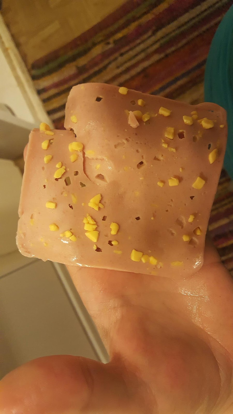
(25,555 posts)We had this all the time. It was kinda vile and slimy. I would have preferred bologna.
Always on white bread with no butter, mayo...just a slap of lunch meat on dry bread....
Even worse was cold Spam sandwiches...once again just a slab of meat on white bread.
Spam is the bane of my existence...
Me: "What's for lunch?"
Mom: "Spam".
Just not good memories...sure it was probably better than "gruel"...LOL She only tried olive loaf on us once and fortunately never subjected us to "Head Cheese" or "Blood Cheese" or whatever that was...(Mom didn't like organ meat..thank God!)
The thing is: We were upper middle class. I would watch these shows where kids had real food for lunch, but we were subject to orphanage style food for lunch...Supper was always cooked, but lunch was kinda like prison food..
I eventually resorted to plain old jelly sandwiches until I was old enough to cook for myself. However, we were always traveling in a trailer and I was kinda at my mom's mercy...
Because of this my kids never had Campbells soup. Always served them homemade chicken soup. I sometimes had a pack of bologna in the fridge, but it was there decision if they wanted it.

All of the Oscar Mayer lunch meats cost the same, but she always got us the vile ones...For instance, we never had salami..(My dad had salami and my dad made his own Dagwood sandwiches with it. I learned to make sandwiches from my dad...LOL)
https://welcometomyrtlewood.com/2019/01/13/pinching-a-loaf-part-i/
Blue_true
(31,261 posts)I can see why your memories of Campbell soup aren’t good.
If I had kids, I would not spoil them, but I also would not have them eating below a level that my income could afford.
I came from a dirt poor family (but land rich). Campbell soup was a mainstay and was one of the “better” foods that my parents could afford. My parents tried to give us whatever nice things they could afford, I remember Wednesday night ice cream (I quake today thinking about what was in that ice cream, lots of filers - but I really appreciate their effort looking back now) and Friday night homemade burgers with trimmings (real fresh tomato and lettuce and old fashioned cheddar cheese (the type that came in slabs)).
I never had real salami until I reached college and ordered my first ever Italian sub (financial aid then was such that even poor students had money for a sparse few food niceties).
LeftInTX
(25,555 posts)She also couldn't cook, but she did manage to make us supper every night.
She would rave about Spam and "Meat with Little Cheeses".
She did have mental illness, so maybe that was why she liked those lunch meats.
She also liked burnt food...ugh....
jcmaine72
(1,773 posts)Okay, so they added a picture of a tomato to the can and changed the font, but that's hardly a "new design". It looks more like a variation of the old design.
I can't help but to think of Mike Brady's building designs from the Brady Bunch Movie. They were all just variants of the of the Brady house. That's what this is like.