The one tax graph you really need to know
I do not know if this was posted before however, it might be worth looking at again.
http://www.washingtonpost.com/blogs/wonkblog/wp/2012/09/19/heres-why-the-47-percent-argument-is-an-abuse-of-tax-data/
Posted by Ezra Klein on September 19, 2012 at 1:37 pm
This entire conversation is the result of a (largely successful) effort to redefine the debate over taxes from “how much in taxes do you pay” to “how much in federal income taxes do you pay?” This is good framing if you want to cut taxes on the rich. It’s bad framing if you want to have even a basic understanding of who pays how much in taxes.
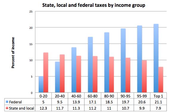
There’s a reason some would prefer that more limited conversation. For most Americans, payroll and state and local taxes make up the majority of their tax bill. The federal income tax, by contrast, is our most progressive tax — it’s the tax we’ve designed to place the heaviest burden on the rich while bypassing the poor. And we’ve done that, again, because the working class is already paying a fairly high tax bill through payroll and state and local taxes.
snip
Which is why, if you want to understand who’s paying what in taxes, you don’t want to just look at federal income taxes, or federal payroll taxes, or state sales taxes — you want to look at total taxes. And, luckily, the tax analysis group Citizens for Tax Justice keeps those numbers. So here is total taxes — which includes corporate taxes, income taxes, payroll taxes, state sales taxes, and more — paid by different income groups and broken into federal and state and local burdens:
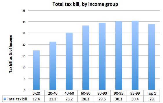
But here is really the only tax graph you need: It’s total tax burden by income group. And as you’ll see, every income group is paying something, and the rich aren’t paying much more, as a percentage of their incomes, then the middle class.
 = new reply since forum marked as read