General Discussion
Related: Editorials & Other Articles, Issue Forums, Alliance Forums, Region ForumsThe Middle East, explained in one (sort of terrifying) chart
By Max Fisher, Published: August 26 at 12:42 pm
What could be simpler than the Middle East? A well-known Egyptian blogger who writes under the pseudonym The Big Pharaoh put together this chart laying out the region’s rivalries and alliances. He’s kindly granted me permission to post it, so that Americans might better understand the region. The joke is that it’s not a joke; this is actually pretty accurate.

There are rivals who share mutual enemies, allies who back opposite sides of the same conflict, conflicting interests and very strange bedfellows. There are two categories of countries: the ones that meddle (the United States, Iran, Saudi Arabia, Qatar, Turkey and Israel) and the ones that are meddled with (Egypt, Syria, Lebanon and the Palestinian territories). Each of the former is pushing for a different outcome in each of the latter, falling in and out of cooperation and competition. And that long-running interference is an important part of why conflict persists.
It’s all kind of a scramble. The Big Pharaoh writes: “I keep on updating this chart because every time I look at it I discover that I’ve missed an arrow. That’s how complicated it is.”
http://www.washingtonpost.com/blogs/worldviews/wp/2013/08/26/the-middle-east-explained-in-one-sort-of-terrifying-chart/?wprss=rss_world&clsrd
 = new reply since forum marked as read
Highlight:
NoneDon't highlight anything
5 newestHighlight 5 most recent replies
= new reply since forum marked as read
Highlight:
NoneDon't highlight anything
5 newestHighlight 5 most recent replies

Tx4obama
(36,974 posts)

DreamGypsy
(2,252 posts)The French hate the Germans,
The Germans hate the Poles.
Italians hate Yugoslavs,
South Africans hate the Dutch.
And I don't like anybody very much!

Jack Rabbit
(45,984 posts)[center]
[/center]
liberal_at_heart
(12,081 posts)No wonder anytime a western power gets involved militarily in this region it just ends up messy and a failure.

Revanchist
(1,375 posts)Pointed at the USA?

Recursion
(56,582 posts)Don't feel bad. Diplomats have been doing that for centuries.

Laelth
(32,017 posts)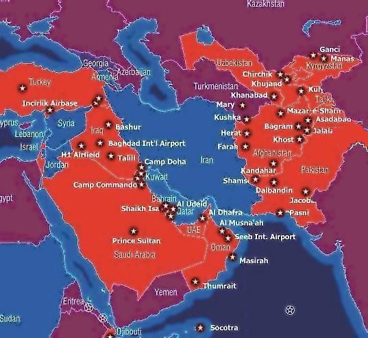
We have Iran nearly surrounded (the stars are U.S. military bases, fyi). Syria is Iran's proxy state. Thus, Syria must go down (or, so goes the thinking of our hawks). Taking out Syria is merely a prelude to our seemingly inevitable attack on Iran. It appears that this has been in the works for some time.

-Laelth