Welcome to DU!
The truly grassroots left-of-center political community where regular people, not algorithms, drive the discussions and set the standards.
Join the community:
Create a free account
Support DU (and get rid of ads!):
Become a Star Member
Latest Breaking News
General Discussion
The DU Lounge
All Forums
Issue Forums
Culture Forums
Alliance Forums
Region Forums
Support Forums
Help & Search
The historical origins of Air Force One's current design
Michael Beschloss on historical origins of Air Force One's current design, originally published in New York Times, 2015:
https://www.nytimes.com/2015/08/09/upshot/the-man-who-gave-air-force-one-its-aura.html …
Link to tweet
AUGUST 3, 2018
Designers give Air Force One a fresh, rainbow-hued look
Trump would really hate it.
BY KATHARINE SCHWAB
In 1962, legendary graphic designer Raymond Loewy offered to give Air Force One a new look. Of the several sketches that Loewy proposed, President Kennedy chose one with red and gold coloring–and asked that it be rendered in blue, his and First Lady Jackie Kennedy’s favorite color. President Kennedy’s choice has been an American emblem since. That is, until President Trump took office–and decided the classic design wasn’t “American” enough.
The San Francisco and New York-based design firm Collins has taken it upon itself to offer the president some new options. However, all of their designs are inspired by Loewy’s original one to preserve the designer’s legacy while giving Air Force One a modern update.
“Loewy nailed the design over 50 years ago,” Brian Collins, the co-founder and chief creative officer of Collins tells Fast Company via email. “It has withstood the test of time, as good design should. That said, when something must change, we begin all of our work by examining what came before, understanding what makes that idea so compelling over time. And then we try to build on those qualities to create something new.”
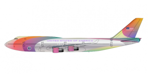
The studio’s new ideas retain the elegant, aerodynamic lines of Loewy’s original, but with bolder colors. One is predominantly blue, with touches of red and white. Two others are similar-looking remixes with different combinations of the American colors. The fourth is the most fun: It looks like a rainbow–an exuberant celebration, perhaps, of the diversity that Trump derides?
Collins says his team wasn’t explicitly trying to recall the pride flag. “We don’t see it as a rainbow,” Collins says. “We see it as a sort of multi-colored tapestry that speaks to the variety of people, hopes, and ambitions that make up America. Considering that Air Force One might not be updated for another 55 years, we figured why not leverage some of Loewy’s streamlined gestures, but make it more… surprising?”
Designers give Air Force One a fresh, rainbow-hued look
Trump would really hate it.
BY KATHARINE SCHWAB
In 1962, legendary graphic designer Raymond Loewy offered to give Air Force One a new look. Of the several sketches that Loewy proposed, President Kennedy chose one with red and gold coloring–and asked that it be rendered in blue, his and First Lady Jackie Kennedy’s favorite color. President Kennedy’s choice has been an American emblem since. That is, until President Trump took office–and decided the classic design wasn’t “American” enough.
The San Francisco and New York-based design firm Collins has taken it upon itself to offer the president some new options. However, all of their designs are inspired by Loewy’s original one to preserve the designer’s legacy while giving Air Force One a modern update.
“Loewy nailed the design over 50 years ago,” Brian Collins, the co-founder and chief creative officer of Collins tells Fast Company via email. “It has withstood the test of time, as good design should. That said, when something must change, we begin all of our work by examining what came before, understanding what makes that idea so compelling over time. And then we try to build on those qualities to create something new.”
The studio’s new ideas retain the elegant, aerodynamic lines of Loewy’s original, but with bolder colors. One is predominantly blue, with touches of red and white. Two others are similar-looking remixes with different combinations of the American colors. The fourth is the most fun: It looks like a rainbow–an exuberant celebration, perhaps, of the diversity that Trump derides?
Collins says his team wasn’t explicitly trying to recall the pride flag. “We don’t see it as a rainbow,” Collins says. “We see it as a sort of multi-colored tapestry that speaks to the variety of people, hopes, and ambitions that make up America. Considering that Air Force One might not be updated for another 55 years, we figured why not leverage some of Loewy’s streamlined gestures, but make it more… surprising?”
InfoView thread info, including edit history
TrashPut this thread in your Trash Can (My DU » Trash Can)
BookmarkAdd this thread to your Bookmarks (My DU » Bookmarks)
10 replies, 1758 views
ShareGet links to this post and/or share on social media
AlertAlert this post for a rule violation
PowersThere are no powers you can use on this post
EditCannot edit other people's posts
ReplyReply to this post
EditCannot edit other people's posts
Rec (2)
ReplyReply to this post
10 replies
 = new reply since forum marked as read
Highlight:
NoneDon't highlight anything
5 newestHighlight 5 most recent replies
= new reply since forum marked as read
Highlight:
NoneDon't highlight anything
5 newestHighlight 5 most recent replies
= new reply since forum marked as read
Highlight:
NoneDon't highlight anything
5 newestHighlight 5 most recent replies
The historical origins of Air Force One's current design (Original Post)
mahatmakanejeeves
Jun 2019
OP

Dennis Donovan
(18,770 posts)1. Jesus... that new design is awful.


mahatmakanejeeves
(57,489 posts)2. Agreed. NT

Sinistrous
(4,249 posts)4. Hideous!

dixiegrrrrl
(60,010 posts)6. Trump's choice will look worse, we know tht by now.
I am betting tacky gold predominates.
bur by the time i even gets close to actually DO the change, he will be out of ooffice.

Igel
(35,320 posts)10. Agreed.
I wonder what the other 3 designs look like.
mahatmakanejeeves
(57,489 posts)3. Out of the blue: A look back at Air Force One's classic design
JULY 30, 2018 BY USER
Out of the blue: A look back at Air Force One’s classic design
Written by: Jacopo Prisco, CNN
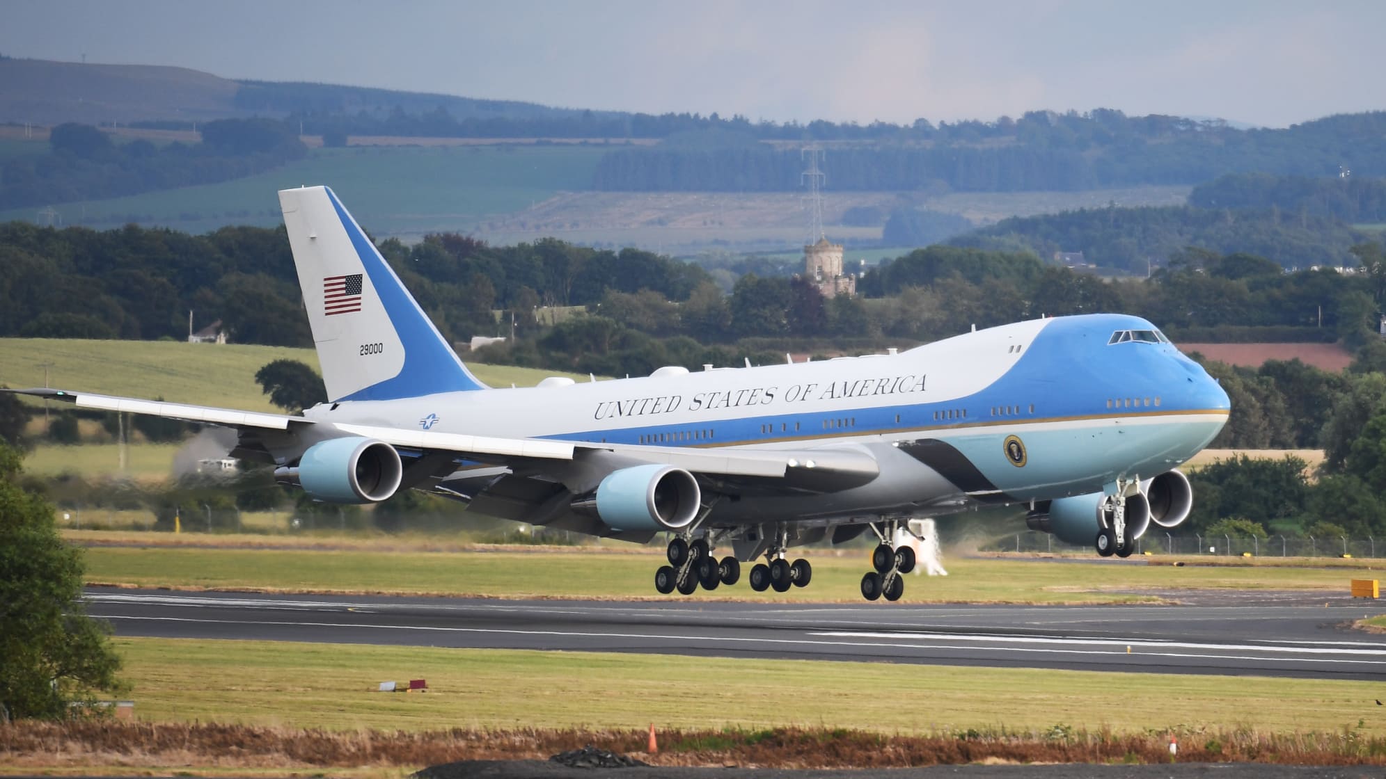
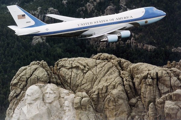
The current look of Air Force One is a true design classic. It dates back to 1962, and is the result of collaboration between JFK and Raymond Loewy, one of the fathers of industrial design.
But after more than five decades and eleven administrations, the elegant livery is getting a makeover. President Trump said he doesn’t like the current aesthetics and intends to replace the blue hue. According to the media platform Axios, the President would like to make it look “more American.” ... Regardless of Trump’s vision, it’s highly likely that the next presidential plane will look different as the current aircraft approach the end of their lifespan and emerging technology makes a replacement necessary.
....
Red, white and blue
During the Reagan administration work began on a new generation of Air Force Ones, with first lady Nancy curating the interior design. But due to a number of delays, the planes only entered service under George H. W. Bush in 1990. While almost every system was upgraded, the paint job was preserved. “A good design brings with it a certain inertia and you really need to have a compelling reason to change it. By that point, it was so widely accepted and universally applauded that they just wanted the new 747 aircraft to have it too,” said Harvesty. ... These are the planes that are still in use today, and the Loewy design has undergone only minor amendments, due to the larger size of the 747s.
“It’s faithful to the Raymond Loewy design as much as possible on a behemoth of a plane. It’s hard to make a 747 look light and sophisticated, but the color, shapes, and typography do a great job. It maintains all the positives from the 1962 version. I’m especially glad that the 1980s didn’t creep in on the design with mauve and almond,” said Adams.
....
SOURCE: CNN

sdfernando
(4,935 posts)5. Raymond Loewy's design is very nearly perfect....
don't mess with perfection.
Other Loewy designs:
Streamlined locomotives for Pennsylvania Railroad
TWA Flight Center terminal at JFK Airport in New York
The iconic Studebaker Avanti
stuffmatters
(2,574 posts)9. Yes, yes. And the Coke bottle!

Historic NY
(37,451 posts)7. The first flight of JFK's new AF-1 went to Stewart AFB - New Windsor Ny...
to attend the funeral of Eleanor Roosevelt in Hyde Park, New York on Nov 10, 1962. He brought Truman and Eisenhower with him. LBJ came on his own plane landing in Dutchess Co.
[link: |
|
mahatmakanejeeves
(57,489 posts)8. Fly the Gaudy Skies
JULY 30, 2018 BY USER
Fly the Gaudy Skies
by John Wall
John Wall is the author of Streamliner, a biography of Raymond Loewy published by Johns Hopkins University Press. It will go on sale Aug. 15.
News outlets just announced that the Trump administration is going to redesign Air Force One, the Boeing 747 with the iconic blue-on-blue-on-white paint job that has heralded the arrival of every American president since John F. Kennedy.
Raymond Loewy is rolling over in his grave. First, for not receiving design credit from various news outlets trumpeting the Trumpian redo. Most media incorrectly credited Kennedy with the design. Second, for having one of his greatest visual branding triumphs overhauled by a person whose design aesthetic is “let’s see how much more gold we can pile on this.”
....
Let’s take a step back for a moment and consider. Do we really want the person who “personally oversees” every aspect of his brand–including Trump Success (a fragrance), Trump Steaks, Trump Casinos, Trump ties (extra long) and Trump wine – to come up with an aircraft design that can compete with the majesty, dignity and stateliness of the current look?
I think not. And Raymond Loewy would agree with me.
SOURCE: History Network