The DU Lounge
Related: Culture Forums, Support ForumsRidiculous Real Estate Photos
“40 Times People Found Such Ridiculous Real Estate Photos, They Just Had To Shame Them ...”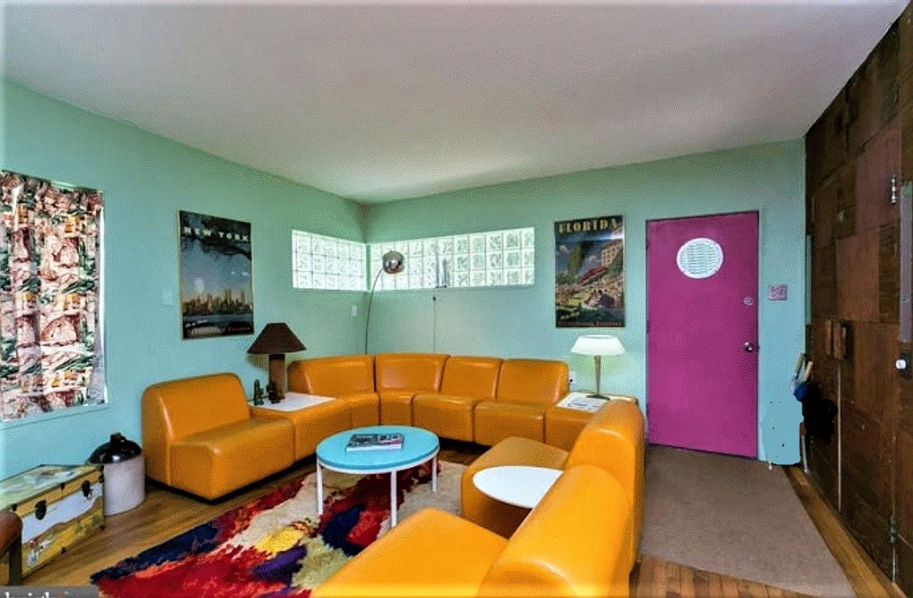
https://www.boredpanda.com/funny-ridiculous-real-estate-photos/?utm_source=newsletter&utm_medium=referral&utm_campaign=Newsletter
 = new reply since forum marked as read
Highlight:
NoneDon't highlight anything
5 newestHighlight 5 most recent replies
= new reply since forum marked as read
Highlight:
NoneDon't highlight anything
5 newestHighlight 5 most recent replies

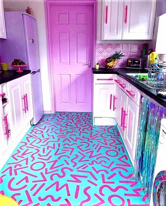
mahatmakanejeeves
(57,461 posts)blueinredohio
(6,797 posts)And no I didn't do it. It was already there when I bought the house.

Harker
(14,019 posts)
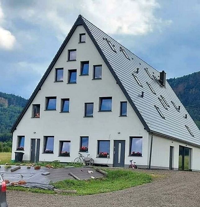
ret5hd
(20,491 posts)Harker
(14,019 posts)I like what I see of the windowed place, though.

NBachers
(17,110 posts)There's that, I suppose.

BlueGreenLady
(2,824 posts)BlueGreenLady
(2,824 posts)

OhZone
(3,212 posts)
highplainsdem
(48,989 posts)So could all those windows in the second photo.
Peregrine Took
(7,414 posts)The photos are taken with no regard at all. Sloppy house, unmade beds, dishes in the sink and the inevitable photo of the toilet.
What's with that? I assume they have one.

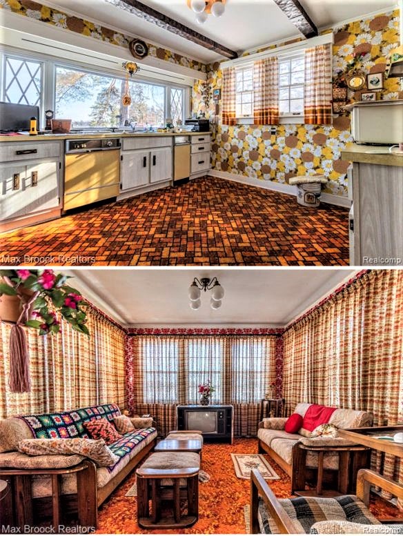
PXR-5
(522 posts)those beams on the ceiling in the 70s.
And that last one, um...
well it looks like my place lol however my TV is older!
I have a restored 1949 Philco.
delisen
(6,044 posts)
2naSalit
(86,636 posts)Psychedelic nightmare! Yikes.
I think the first one might have been done by someone who is colorblind.

forgotmylogin
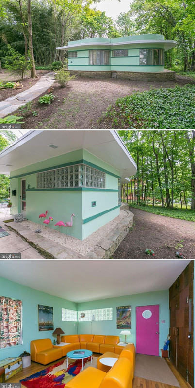
(7,529 posts)I don't know if the color in the picture is off, but other than the wall being a little too green - if the were a bit bluer it looks like they were using the earth tone+sky colors in the trunk as a reference palette. The wall by the trunk *does* look bluer to match, the far ceiling corner looks as though it just needs cleaned or repainted (or may be reflecting a grass tone from outside the windows?). The pink door is a legit accent choice.
It's a great conversation pit, I'd just change the walls to make it a little less "dentist office". Bluer walls (match the tabletop), red door to match the carpet, and change the curtain on the left to a neutral or containing the burnt-orange couch tone, and it's actually fine. I'd also elect to paint the ceiling either same as the walls or matching the door. With a palette that vivid, you can't include too many extra off-colors.
NBachers
(17,110 posts)forgotmylogin
(7,529 posts)That's probably why it looked like I'd enjoy it! It could be a Miami Vice escape room!

OriginalGeek
(12,132 posts)or someone from FL who was homesick.
I kinda dig it.

LakeArenal
(28,819 posts)Most of it was just out dated but functional.

hunter
(38,313 posts)Same color scheme, same glass brick windows, everything.
There was a great restaurant next door.
It was pretty wonderful actually.
unc70
(6,114 posts)No way to describe most of these houses!!

rickford66
(5,523 posts)Check out McMansion Hell
https://mcmansionhell.com/
3catwoman3
(23,996 posts)…the suburb of Barrington, mentioned in the article, where the author says 9 of the 10 worst offending houses are located.
They are into ostentation there. A house I drove by on my way to work looked like a castle, complete with turrets, and was reputed to have 13,000 square feet of living space.

TreasonousBastard
(43,049 posts)can't help wondering why people don't have much imagination.
Oh, and some handy ideas for fixing up your double wide there.
Stuart G
(38,427 posts)
Coventina
(27,120 posts)

TexasBushwhacker
(20,191 posts)I'd like it better if it was black and white though.

Phentex
(16,334 posts)the builder had it in the back with the guest bedroom in front but they changed the plan and now have the bathroom in the front with very large windows and blinds that they never open. If they had put it in the back, the large tub would overlook the woods. No, now the bedroom has small windows along the top edge of the room and no view.
