Photography
Related: About this forumohheckyeah wants to play with one of my photos, and I invite you all to play, too!
Last edited Tue Jul 15, 2014, 01:18 AM - Edit history (1)
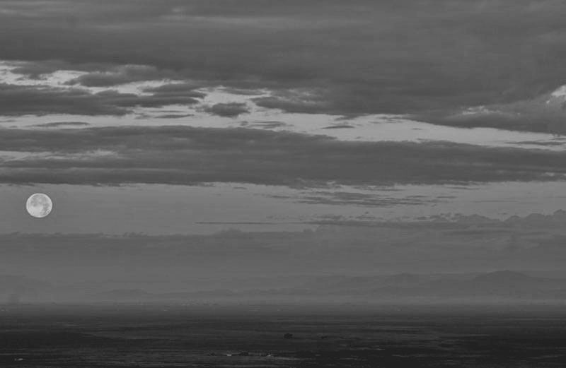
ohheckyeah told me she wanted to try turning one of my color supermoon photos into a black and white image, a la Ansel Adams. I tried doing this myself and wasn't happy with the results - about as far from the sharp clarity of Adams' work as I could be, imo. Still, I'm entranced by the idea of someone interpreting my image in a different way. After all, all art is derivative, right? 
So in the spirit of derivative art and using other images to inform our own styles, here's a little processing challenge: take any of my three images at the above link and manipulate them as you wish. If you want to try making them b&w, knock yourself out. If you think King Kong should be riding the moon, hey, that's your gig and you should try to make it happen. Whatever floats your boat, Kids (as long as you keep it safe for the kids).
For the record, here's my pitiful attempt at converting one of the moon shots to black and white. Looks mushy to me!

 = new reply since forum marked as read
Highlight:
NoneDon't highlight anything
5 newestHighlight 5 most recent replies
= new reply since forum marked as read
Highlight:
NoneDon't highlight anything
5 newestHighlight 5 most recent replies
Response to intheflow (Original post)
ohheckyeah This message was self-deleted by its author.

ohheckyeah
(9,314 posts)Here's my vision of it:
[url=https://flic.kr/p/ok8L5d][img] [/img][/url]

intheflow
(28,474 posts)That looks great!  I can totally see the similarity in the Adams' print when you work your magic. I had no idea my shot could look that good and crisp!
Nice work! 
ohheckyeah
(9,314 posts)I added some contrast. I decreased the exposure overall and then added exposure and highlights to other areas. Then I added clarity to the whole photo.
Ansel Adams did the same thing in the darkroom to his print. I imagine he used a high contrast filter in the enlarger and then dodged and burned.
I'm glad you like it. 

Curmudgeoness
(18,219 posts)That is really nice. I have not gotten close to anything worth showing off. But I am still an infant as far as post-processing goes.
ohheckyeah
(9,314 posts)I could have spent some more time on it but my back deemed it was time to get out of this chair.
I've been using Photoshop for years, but now find that I prefer Lightroom most of the time. It's a great program and there are many free video tutorials on the Adobe website. It has a learning curve but nowhere near the learning curve of Photoshop.
intheflow
(28,474 posts)

ohheckyeah
(9,314 posts)
NV Whino
(20,886 posts)Multiple processes. All of these were done in Perfect Photo Suite 8.

Albumen

Ansel in the Valley

ohheckyeah
(9,314 posts)I found that the hardest of the three to work with because of the lack of tonal range. Good job!
intheflow
(28,474 posts)It carries a real feeling of romance with it, very sweet. The framing contributes to the feel, certainly, but the light sepia is dreamy! 
NV Whino
(20,886 posts)The tones are so nice.
ohheckyeah
(9,314 posts)[url=https://flic.kr/p/onE8kX][img] [/img][/url]
[url=https://flic.kr/p/o4qufc][img] [/img][/url][url=https://flic.kr/p/o4qufc]full moon2[/url]
intheflow
(28,474 posts)The craters are perfect, and the dark clouds perfect. But I have to admit, I'm not crazy about the bottom one. It's completely my own bias as it's my favorite of the original three. I love that you can see the green ground but the sun hasn't risen so much that the fields are pink. It's right on the cusp of the sunrise and that feeling of "almost/anticipation" is lost when converted to black and white.
Though I kind of like it cropped. This was the sharpest moon I shot, I think.

ohheckyeah
(9,314 posts)The second one didn't have a lot of color range so there was little tonal range when converted to black and white and the bottom one lost a lot in the conversion.

groundloop
(11,519 posts)[URL= .html][IMG]
 [/IMG][/URL]
[URL= .html][IMG]
 [/IMG][/URL]
intheflow
(28,474 posts)I thought my original was pretty rich, but I have two windows open with the images side by side and whatever you did really brought out the best of the shadows and light. The moon is made of green cheese? Naw - your adaptation proves it's made of butter!
The bottom one... I'm not sure what to quite make of it. On one hand, I like the minimalist feel of it. OTOH, I wonder if I would peg it as the moon among clouds if I didn't already know what it was when it began. Part of me wants to make a meme out of it, putting some kind of moon quote along the bottom. And then, I couldn't help myself, I had to do this:


Richard D
(8,754 posts)
intheflow
(28,474 posts)I love how you kept definition in the foreground yet somehow also make the moon pop out above the clouds! I also like how the cloudbank could almost be a bigger mountain in the background. There's something otherworldly about the processing, too. Like this could be the view of a moon on another planet. Nicely done, Richard D! 