Economy
Related: About this forumSTOCK MARKET WATCH - Friday, 13 September 2019
STOCK MARKET WATCH, Friday, 13 September 2019
Previous SMW:
SMW for 12 September 2019
AT THE CLOSING BELL ON: 12 September 2019
Dow Jones 27,182.45 +45.41 (0.17%)
S&P 500 3,009.57 +8.64 (0.29%)
Nasdaq 8,194.47 +24.79 (0.30%)
+++++++++++++++++++++++++++++++++++++++++++++++++++++++++++++++++++++++
Market Conditions During Trading Hours:
Google Finance
MarketWatch
Bloomberg
Stocktwits
(click on links for latest updates)
+++++++++++++++++++++++++++++++++++++++++++++++++++++++++++++++++++++++
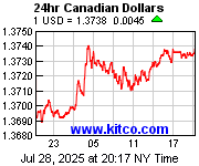
Currencies:
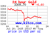
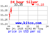
Gold & Silver:
Petroleum:


+++++++++++++++++++++++++++++++++++++++++++++++++++++++++++++++++++++++
DU Economics Group Contributor Megathreads:
Progree's Economic Statistics (with links!)
mahatmakanejeeves' Rail Safety Megathread
+++++++++++++++++++++++++++++++++++++++++++++++++++++++++++++++++++++++

This thread contains opinions and observations. Individuals may post their experiences, inferences and opinions on this thread. However, it should not be construed as advice. It is unethical (and probably illegal) for financial recommendations to be given here.
 = new reply since forum marked as read
Highlight:
NoneDon't highlight anything
5 newestHighlight 5 most recent replies
= new reply since forum marked as read
Highlight:
NoneDon't highlight anything
5 newestHighlight 5 most recent replies

progree
(10,901 posts)Last edited Fri Sep 13, 2019, 07:21 AM - Edit history (1)
This link shows the Dow 9/11/19 high and close as 27,137:
https://kshitij.com/graph-gallery/equities/dowjones-candles-Daily
as does this tiny thumbnail:
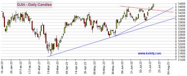
I realize the Dow closed today, 9/12/19 at 27,182, but the 9/11 closing graphs are the latest that I can find on the kshitij.com site.
For some unknown reason, when I copy and paste the graph in the first link above to here, it is like the graph in the OP, where the top of the candle is at most 26,925 (70% of the way between the 26,750 and the 27,000 lines). This is also the same graph as in the OP:

It seem to be a couple days older than even 9/11 (later edit: after a lot of squinting, I think it is the 9/10 close, so in this case it is just one day older than the thumbnail) --
(Anyone reading this Friday or later might see different graphs than what is appearing at 840p ET Thursday 9/12 as I write and post this)
Here's the recent daily open, high, low, and close
https://finance.yahoo.com/quote/%5EDJI/history?p=%5EDJI
From Tuesday, https://www.democraticunderground.com/?com=view_post&forum=1116&pid=86491
I thought it was fixed.
Then we changed the whole template, and I've tried to keep an eye on it when I post each day.
Try refreshing the page and see what happens. I'll take another look at it when I put up Wednesday's thread.
THANKS! for the head up.
Yup, I remember. And it got fixed, thanks! -- well, it seemed to be lagging by a day sometimes (I don't know how long after the 400p ET close before they update their graph, but oh well, I'm not going to complain about a day). And it was working fine except for the up-to-one-day lag, since then, including after the new template. It was about 2-3 weeks ago when I first noticed that there was sometimes a multi-day lag of as much as 4 or 5 business days.
I have been doing refreshes, but the graph either doesn't change, or a couple of days later if I refresh, it will advance a couple days, but still is behind by a few days from the time of the refresh.
I have no idea how you got it to work last time, nor any idea how to go about fixing or what to try, other than writing them (who might tell us we're not supposed to be embedding their graphs?) ...
Thanks for looking into!
Edited to add: I found an explanation of candlestick charts ... things in double parenthesis (( .. )) are things I added. To see the illustrations that go with the text, one can click on the link
Just like a bar chart, a daily candlestick shows the market's open, high, low, and close price for the day. The candlestick has a wide part, which is called the "real body."
This real body represents the price range between the open and close of that day's trading. When the real body is filled in or black ((or red)), it means the close was lower than the open ((a down candle)). If the real body is empty ((or green)), it means the close was higher than the open ((an up candle)).
Traders can alter these colors in their trading platform. For example, a down candle (close lower than the open) is often shaded red instead of black, and up candles (close higher than the open) are often shaded green instead of white.
The top of the candle (usually the top of the wick) is the High. The bottom of the candle (usally the bottom of the wick that extends below the candle), is the Low.
If there is no top wick, than the High and the Close (green candle), or the High and the Open (red candle) are the same.
If there is no bottom wick, than the Low and the Close (red candle), or the Low and the Open (green candle) are the same.

Tansy_Gold
(17,851 posts)If I go back several days to the SMW thread, the candle charts all show the same as the most current thread, so whatever the issue is, it's in the link.
In other words, I include a link here in the Monday SMW post and that produces the graph. But it's the same link as in last Friday's thread, so it's going to show the same graph when you look at Friday's thread. It's not **behind** a couple of days; it's showing the current graph.
Unless I'm missing something?
progree
(10,901 posts)Just to take the last 2 days:
The Thursday 9/12/19 Dow Jones close was 27,182.45
The Friday 9/13/19 Dow Jones close was 27,219.52
And yet the large graph in the OP and in my #1 shows a close (the top of the green candle) about 70% of the way between the 26,750 and 27,000 lines, or about 26,750 + 70% X 250 = 26,925. Anyway, the last point on the graph is well below the 27,000 line. It appears to match the the 9/10/19 statistics (open, high, low, close).
The last candle on the thumbnail seems to match 9/11/19.
Open, high, low, and close of last several days
https://finance.yahoo.com/quote/%5EDJI/history?p=%5EDJI
DATE OPEN HIGH LOW CLOSE
Sep 13, 2019 27,216.67 27,277.55 27,193.95 27,219.52
Sep 12, 2019 27,197.32 27,306.73 27,105.01 27,182.45
Sep 11, 2019 26,928.05 27,137.04 26,885.48 27,137.04
Sep 10, 2019 26,805.83 26,909.43 26,717.05 26,909.43
Sep 09, 2019 26,866.23 26,900.83 26,762.18 26,835.51
progree
(10,901 posts)link is up to date
I just now ( 9/15 130p ET ) looked at the graph shown at this link (one has to click it):
https://kshitij.com/graph-gallery/equities/dowjones-candles-Daily
And it shows a little table above the graph with the 9/13 open of 27216.67 and a high of 27,277.55 and a close of 27219.52
and the last candle in the graph at the link above has a top wick above the 27,250 line (that's the high) and the candle itself is very short, and just below the 27,250 line -- which matches the open and close (which defines the bottom and top of this green "up" candle)
but when I copy and paste the image, the last candle still matches the 9/10 statistics:
progree
(10,901 posts)hopefully this clarifies the issue by showing the two graphs one above the other.
progree
(10,901 posts)I see the old outdated first image in Chrome, my usual browser. But I decided to try Internet Explorer and it shows the 2nd image (well they updated the trend lines since I took the snapshots).
Shoot, I like Chrome better, but well, that's the way it goes.