dave502d
 (1000+ posts)
Send PM |
Profile |
Ignore
(1000+ posts)
Send PM |
Profile |
Ignore
|
Mon Aug-29-05 04:41 PM
Original message |
| Here's a map showing the concentration of Iraq military deaths |
|
Edited on Mon Aug-29-05 04:41 PM by dave502d
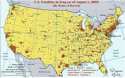 ?v=0 Now take a look at the map showing county-by-county voting in the 2004 presidential election. 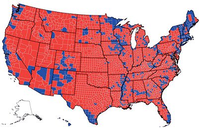 ?v=0 http://bobgeiger.blogspot.com/2005/08/blue-state-losses-give-moral-authority.html |
| sniffa
(1000+ posts)
Send PM |
Profile |
Ignore
|
Mon Aug-29-05 04:43 PM
Response to Original message |
|
there's aLmost no simiLarities.
|
| Richardo
(1000+ posts)
Send PM |
Profile |
Ignore
|
Mon Aug-29-05 04:46 PM
Response to Reply #1 |
|
:spray:
Don'tcha think that there would be more casualties from more populous states? :shrug:
|
| sniffa
(1000+ posts)
Send PM |
Profile |
Ignore
|
Mon Aug-29-05 04:50 PM
Response to Reply #3 |
|
a smattering of the bLue areas match the casuaLties, if that.
at Least puLL out some fake map and get an urban Legend started.
|
| Igel
(1000+ posts)
Send PM |
Profile |
Ignore
|
Mon Aug-29-05 04:55 PM
Response to Reply #3 |
| 6. There are. The 7 or 8 most populous states have the |
|
largest number of soldiers dead from Iraq.
A lot of the blue areas still have "red" populations, and a lot of blue areas are ringed by high-population red areas.
|
| PatrioticLeftie
(909 posts)
Send PM |
Profile |
Ignore
|
Mon Aug-29-05 04:43 PM
Response to Original message |
|
Rummy and Co aren't so concerned with getting them out, they figure the blue voters are the ones being killed.
|
| Igel
(1000+ posts)
Send PM |
Profile |
Ignore
|
Mon Aug-29-05 04:59 PM
Response to Reply #2 |
| 9. There's a stronger correlation between "redness" and |
|
casualty rate.
"Blue" states have greater number of casualties, but that's because they have larger "red" populations than many red states.
One problem with the yellow/rust casualty map is how they cluster the dots: I think they can touch, but they can't overlap. That means that some clusters spread out too much. That hides some blue areas (Santa Monica/West LA, part of Chicago).
|
| nashbridges
(349 posts)
Send PM |
Profile |
Ignore
|
Mon Aug-29-05 04:53 PM
Response to Original message |
| 5. It's a somewhat bogus statistic |
|
Kind of like, "90% of all car accidents happen within 20 miles of your home". You do 90% of your driving within 20 miles of your home, so there's no weight to it.
It follows that states with a higher population density will have a higher representation of deaths.
|
| ComerPerro
(1000+ posts)
Send PM |
Profile |
Ignore
|
Mon Aug-29-05 04:57 PM
Response to Reply #5 |
| 7. Yeah, but conservatives always argue that the amount of red shows |
|
how great Bush is and what a man date he won with.
So, using this map to say that liberal areas are the ones actually sacraficing is just turning their reasoning back on them.
|
| catnhatnh
(1000+ posts)
Send PM |
Profile |
Ignore
|
Mon Aug-29-05 04:58 PM
Response to Original message |
| 8. While it does look damning.... |
|
keep in mind that the most urban,hence populated areas, also tend to be the most democratic. Realize that a single death in a county turns the entire county to its voting preference color...In a state like New York with the immediate Manhattan/Queens/Brooklyn/Bronx/Staten Island area having over 8 million inhabitants. I read that Texas contains something like 268 counties, many with less than 5000 population.Other states have only 10 to 15 counties. In short these maps are Not like comparing apples and oranges-they are more like comparing bicycles and fish....
|
| catnhatnh
(1000+ posts)
Send PM |
Profile |
Ignore
|
Mon Aug-29-05 06:03 PM
Response to Reply #8 |
| 10. Also, replying to myself.... |
|
....a red county with highlighting because of a combat death MAY have lost a single young Democrat. A dead young LIBERAL and PATRIOT from a southern state county could turn the entire county RED on these maps....Being a DUer I should point out that this an unlikely happening in blue counties from which young conservatives MAY have died,but seldom as the sole combat loss.I regret ALL the losses.
|
DU
AdBot (1000+ posts)     |
Thu Apr 18th 2024, 02:03 PM
Response to Original message |