| Latest | Greatest | Lobby | Journals | Search | Options | Help | Login |
|
|
|
This topic is archived. |
| Home » Discuss » DU Groups » Arts & Entertainment » Photography Group |
|
| JeffR
|
Sun Nov-26-06 05:33 PM Original message |
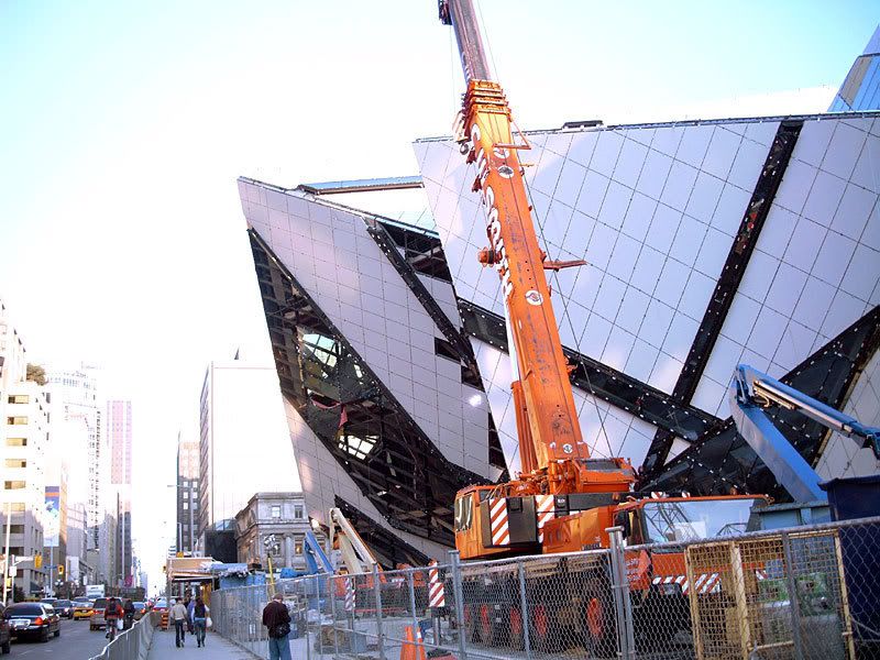
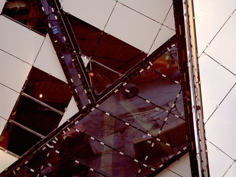
| Ach du Libeskind! Some pics for 48percenter: |
| Printer Friendly | Permalink | | Top |
| Eurobabe
|
Mon Nov-27-06 02:18 AM Response to Original message |
| 1. Hi Jeff, thanks for the photos!! Two words... |
| Printer Friendly | Permalink | | Top |
| JeffR
|
Mon Nov-27-06 09:09 AM Response to Reply #1 |
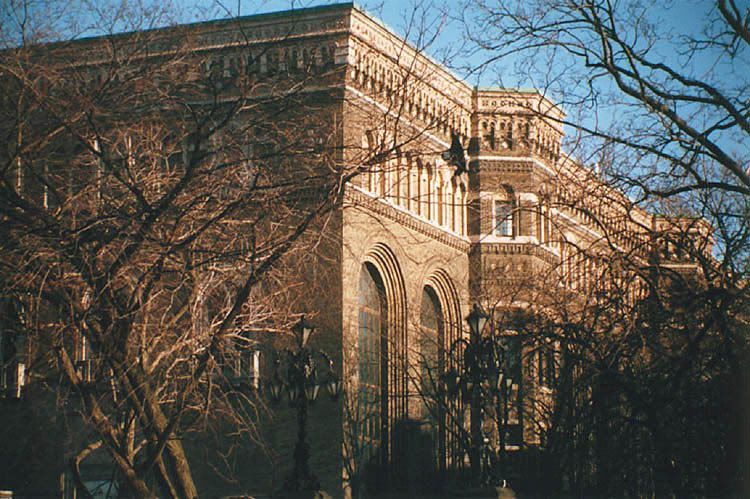
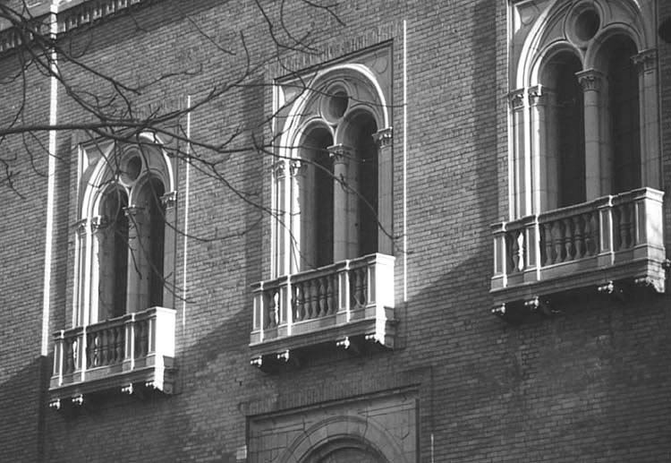
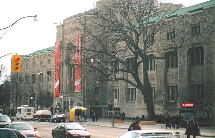
| 2. For comparison's sake, I should have posted these |
| Printer Friendly | Permalink | | Top |
| Eurobabe
|
Mon Nov-27-06 10:30 AM Response to Reply #2 |
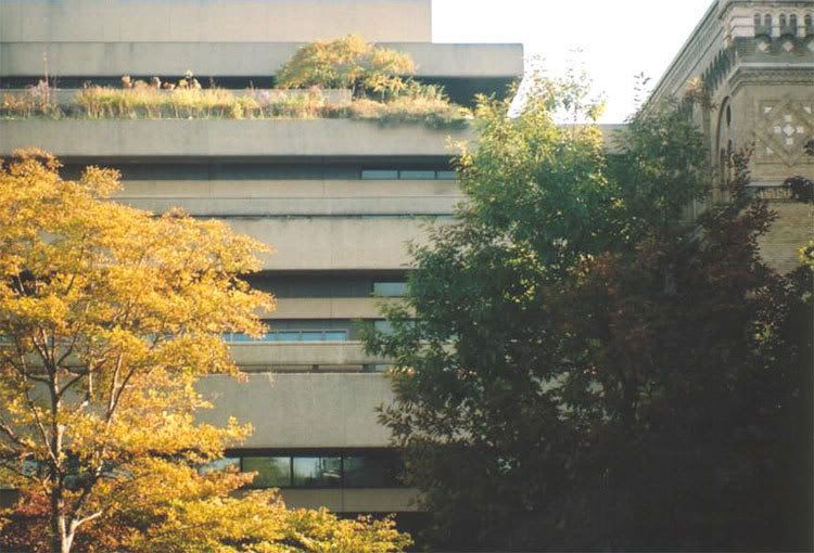
| 3. Well, the POMO bunker was ugly too, I don't know which is worse? |
| Printer Friendly | Permalink | | Top |
| JeffR
|
Mon Nov-27-06 12:18 PM Response to Reply #3 |
| 4. Libeskind's sits (squats?) where the '83 wing was |
| Printer Friendly | Permalink | | Top |
| Eurobabe
|
Mon Nov-27-06 01:09 PM Response to Reply #4 |
| 5. So if the techtonic plates and mountains were inspiration for the |
| Printer Friendly | Permalink | | Top |
| JeffR
|
Mon Nov-27-06 02:19 PM Response to Reply #5 |
| 7. He's a great bullshitter |
| Printer Friendly | Permalink | | Top |
| NashVegas
|
Mon Nov-27-06 01:15 PM Response to Reply #1 |
| 6. Too Close Up for Me to Form an Opinion |
| Printer Friendly | Permalink | | Top |
| JeffR
|
Mon Nov-27-06 02:25 PM Response to Reply #6 |
| 8. Just read an article about that project & all the controversy |
| Printer Friendly | Permalink | | Top |
| Eurobabe
|
Mon Nov-27-06 03:16 PM Response to Reply #8 |
| 9. What I don't like about Gehry and this building by |
| Printer Friendly | Permalink | | Top |
| Eurobabe
|
Mon Nov-27-06 03:19 PM Response to Reply #6 |
| 10. And that is honoring Nature |
| Printer Friendly | Permalink | | Top |
| DU
AdBot (1000+ posts) |
Fri Apr 26th 2024, 09:41 PM Response to Original message |
| Advertisements [?] |
| Top |
| Home » Discuss » DU Groups » Arts & Entertainment » Photography Group |
|
Powered by DCForum+ Version 1.1 Copyright 1997-2002 DCScripts.com
Software has been extensively modified by the DU administrators
Important Notices: By participating on this discussion board, visitors agree to abide by the rules outlined on our Rules page. Messages posted on the Democratic Underground Discussion Forums are the opinions of the individuals who post them, and do not necessarily represent the opinions of Democratic Underground, LLC.
Home | Discussion Forums | Journals | Store | Donate
About DU | Contact Us | Privacy Policy
Got a message for Democratic Underground? Click here to send us a message.
© 2001 - 2011 Democratic Underground, LLC