| Latest | Greatest | Lobby | Journals | Search | Options | Help | Login |
|
|
|
This topic is archived. |
| Home » Discuss » Archives » General Discussion (01/01/06 through 01/22/2007) |
|
| The Straight Story
|
Fri Nov-10-06 10:52 PM Original message |
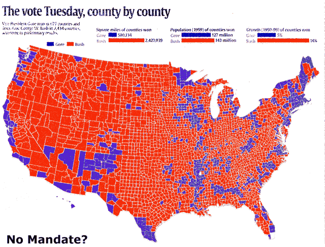
| Anyone remember this map from 2000, called Mandate? What does it look like now? |
| Printer Friendly | Permalink | | Top |
| Warren Stupidity
|
Fri Nov-10-06 10:55 PM Response to Original message |
| 1. I especially like the 'square miles bush won' theory. |
| Printer Friendly | Permalink | | Top |
| The Straight Story
|
Fri Nov-10-06 10:58 PM Response to Reply #1 |
| 7. Would have been more accurate to use a color scale |
| Printer Friendly | Permalink | | Top |
| skipos
|
Fri Nov-10-06 10:55 PM Response to Original message |
| 2. That map makes me realize how many places I should never move to. nt |
| Printer Friendly | Permalink | | Top |
| baldguy
|
Fri Nov-10-06 10:56 PM Response to Original message |
| 3. Blue = people |
| Printer Friendly | Permalink | | Top |
| txindy
|
Fri Nov-10-06 11:00 PM Response to Reply #3 |
| 8. On the 2004 map, yes. Not on the 2000 one, though. |
| Printer Friendly | Permalink | | Top |
| orpupilofnature57
|
Fri Nov-10-06 10:57 PM Response to Original message |
| 4. Agendas and Mandates are easy , Guiding and Managing are impossible |
| Printer Friendly | Permalink | | Top |
| Alexander
|
Fri Nov-10-06 10:57 PM Response to Original message |
| 5. The map is misleading, the counties should have mixed colors. |
| Printer Friendly | Permalink | | Top |
| crickets
|
Fri Nov-10-06 11:13 PM Response to Reply #5 |
| 11. Agreed (purple maps here) |
| Printer Friendly | Permalink | | Top |
| Radio_Lady
|
Fri Nov-10-06 10:57 PM Response to Original message |
| 6. The only map I saw in this election was the set-up of the Congressional seats. |
| Printer Friendly | Permalink | | Top |
| LeahD
|
Fri Nov-10-06 11:07 PM Response to Reply #6 |
| 10. Here's a map from CNN ......looks s-o-o-o much better! |
| Printer Friendly | Permalink | | Top |
| nuxvomica
|
Fri Nov-10-06 11:06 PM Response to Original message |
| 9. There are comparison maps at USAToday |
| Printer Friendly | Permalink | | Top |
| Radio_Lady
|
Fri Nov-10-06 11:35 PM Response to Reply #9 |
| 12. Excellent. Thanks for your research. Very much appreciated. |
| Printer Friendly | Permalink | | Top |
| DU
AdBot (1000+ posts) |
Fri Apr 26th 2024, 01:11 PM Response to Original message |
| Advertisements [?] |
| Top |
| Home » Discuss » Archives » General Discussion (01/01/06 through 01/22/2007) |
|
Powered by DCForum+ Version 1.1 Copyright 1997-2002 DCScripts.com
Software has been extensively modified by the DU administrators
Important Notices: By participating on this discussion board, visitors agree to abide by the rules outlined on our Rules page. Messages posted on the Democratic Underground Discussion Forums are the opinions of the individuals who post them, and do not necessarily represent the opinions of Democratic Underground, LLC.
Home | Discussion Forums | Journals | Store | Donate
About DU | Contact Us | Privacy Policy
Got a message for Democratic Underground? Click here to send us a message.
© 2001 - 2011 Democratic Underground, LLC