Democratic Underground Latest Greatest Lobby Journals Search Options Help Login
Google

the painter V2

Printer-friendly format Printer-friendly format
Printer-friendly format Email this thread to a friend
Printer-friendly format Bookmark this thread
Home » Discuss » DU Groups » Arts & Entertainment » Photography Group Donate to DU
 
rdking647 Donating Member (1000+ posts) Send PM | Profile | Ignore Tue Jul-26-11 09:45 PM
Original message
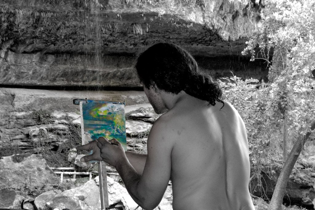
the painter V2
I reedited a photo i posted here last week. let me know what you think of teh changes
Refresh | 0 Recommendations Printer Friendly | Permalink | Reply | Top
Mira Donating Member (1000+ posts) Send PM | Profile | Ignore Tue Jul-26-11 10:12 PM
Response to Original message
1. To me this is much less busy and quite intriguing. A perfect
place to take out color selectively. I'd play with getting rid of half his back maybe, the lit part past the hair and also the center line in the back. And if you have it add some back in on the left. I think then his being shirtless would be a smaller issue to me. but I could certainly be wrong.
A very nice catch!
Printer Friendly | Permalink | Reply | Top
 
Stevenmarc Donating Member (1000+ posts) Send PM | Profile | Ignore Wed Jul-27-11 12:47 AM
Response to Original message
2. Honestly
Edited on Wed Jul-27-11 01:12 AM by Stevenmarc
The whole selective color thing is a bit of a gimmik that is way past it's expiration date. I like the full color version but crop the left side close to the painting and the right side close to his back, it's much more interesting if we don't see the whole scope of what he's seeing and concentrate more on his vision of the scene. Obviously you want our eyes to go to the painting so you need to get rid of most of the background and let his back become a great big negative space then pretty much all that's left for your eyes to gravitate to is the painting.
Printer Friendly | Permalink | Reply | Top
 
KC Donating Member (1000+ posts) Send PM | Profile | Ignore Wed Jul-27-11 07:54 AM
Response to Original message
3. Personally
Edited on Wed Jul-27-11 07:54 AM by KC
I like the original better, the contrast in the colors of what the painter actually sees in the scenery that
he is trying to capture in his painting, but what do I know.
Printer Friendly | Permalink | Reply | Top
 
alfredo Donating Member (1000+ posts) Send PM | Profile | Ignore Wed Jul-27-11 10:21 AM
Response to Original message
4. It looks 3D. I like that.
Printer Friendly | Permalink | Reply | Top
 
DU AdBot (1000+ posts) Click to send private message to this author Click to view 
this author's profile Click to add 
this author to your buddy list Click to add 
this author to your Ignore list Fri May 03rd 2024, 06:21 AM
Response to Original message
Advertisements [?]
 Top

Home » Discuss » DU Groups » Arts & Entertainment » Photography Group Donate to DU

Powered by DCForum+ Version 1.1 Copyright 1997-2002 DCScripts.com
Software has been extensively modified by the DU administrators


Important Notices: By participating on this discussion board, visitors agree to abide by the rules outlined on our Rules page. Messages posted on the Democratic Underground Discussion Forums are the opinions of the individuals who post them, and do not necessarily represent the opinions of Democratic Underground, LLC.

Home  |  Discussion Forums  |  Journals |  Store  |  Donate

About DU  |  Contact Us  |  Privacy Policy

Got a message for Democratic Underground? Click here to send us a message.

© 2001 - 2011 Democratic Underground, LLC